Writing & Videos — Page 11
Page 11 of 14: older articles, tutorials, and videos.
September 2025

Building a Redis clone in Go - Part 3 (Concurrent Server, Config Parser)
I add concurrency to my Go Redis clone by wrapping the store in a sync.RWMutex — ReadLock for GET, Lock for SET — so multiple clients can hit the same commands without race conditions, then build a parser for a minimal…

Building a Redis clone in Go - Part 2 (GET, SET, Writing to client)
I build the actual data layer of my Go Redis clone: GET and SET handlers over an in-memory map, plus a Writer abstraction that serializes my Value structs into RESP so I never hand-construct plus signs and CRLF pairs…

Building a Redis clone in Go - Part 1 (TCP server, RESP protocol)
I build the first working layer of a Redis clone in Go: a TCP server on port 6379 that speaks enough RESP to parse real redis-cli commands. I install Redis only to use its client, stop the official server, then…

How to pick perfect icon libraries
I explain how to pick an icon library for a design project by comparing real icon sets and the tradeoffs that matter. I argue that you should stick to one library for consistency, choose a large comprehensive pack like…
August 2025
The easy trick to creating perfect layouts every time
I show why you should never stretch UI elements to fill the screen and how to size each component to its ideal width instead. I demonstrate this with a login form: removing its 576px max-width makes it stretch across…
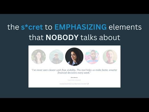
The secret to emphasizing elements properly - visual hierarchy tricks
I show how to emphasize an active element by de-emphasizing the inactive ones around it, using a testimonial carousel where reduced opacity and size make the current testimonial obvious at a glance. I demonstrate that…
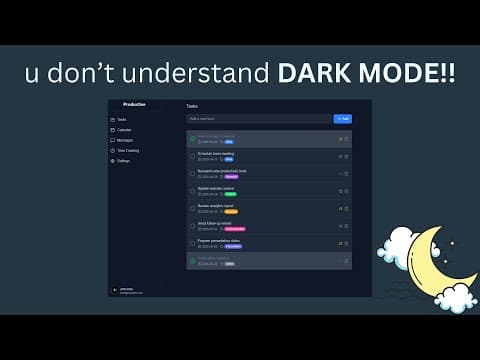
Stop f*cking up dark mode
Most designers ruin dark mode by naively inverting their light-mode colors, so I break down the four tactics I use to build dark interfaces that are actually pleasant to read. I show why pure black backgrounds create…
Semantic styling is ruining your designs
Stop styling buttons by semantic color meaning and start styling them by visual hierarchy. I put two identical UIs side by side — one with green, blue, and red semantic buttons where every action screams equally, and…
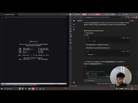
Learning neovim from scratch p1
I start learning Neovim from scratch by installing it in WSL Debian and building my own config instead of reaching for LazyVim or Kickstart, because prebuilt distros get you productive but don't teach you how Neovim…
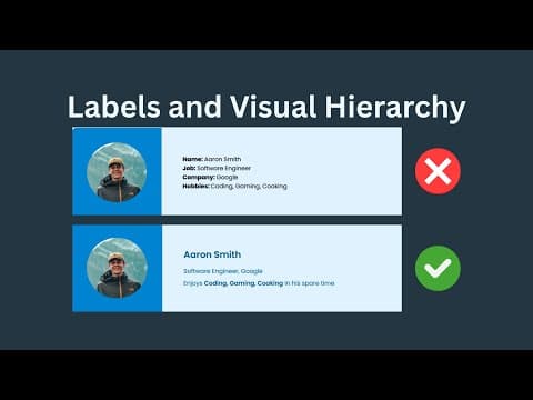
This is how you actually create good visual hierarchy
I explain how to actually create visual hierarchy by deciding whether the data or the labels deserve emphasis, then using font size, weight, color, spacing, borders, and shadows to make that hierarchy obvious. I start…
Choosing b/w headline fonts and body fonts
Choosing between headline and body fonts comes down to two measurable properties — x-height and letter spacing — and I compare real fonts side by side to show how each one signals the job a font was designed for. I set…
Creating an electron+react dev environment with webpack
I build an Electron + React + TypeScript + Tailwind starter from scratch with Webpack, then wire up development hot reload, production builds, and electron-builder packaging into an installable desktop app. I show why…


Dude, you’re at the bottom of my landing page.
Just book a call already if you’re that interested.
You scrolled all the way here.